Nextstop 2 Layout Overview
Nextstop 2 is made up of three primary sections: title bar, content area, and navigation area. These areas of the interface stay consistent throughout the application.
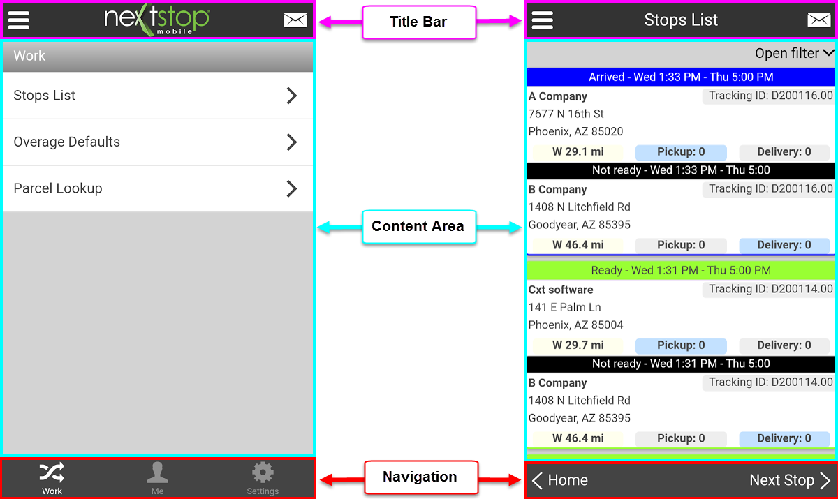
Title Bar
The title bar is located at the top of every screen in Nextstop 2. This area is always located at the top of the screen and does not move when the content area is scrolled. There are three primary components of the title bar, which are, the pull-out menu icon, the screen title, and the messages icon. Listed below are descriptions of each area's functionality.
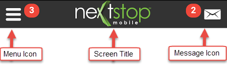
Menu Icon
- When a red number is displayed next to the pull-out Menu icon, there are new notifications waiting for acknowledgment.
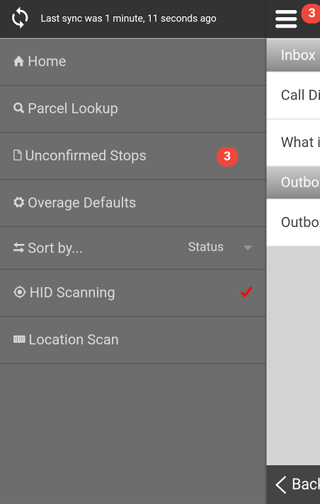
- Selecting the pull-out Menu icon expands the Menu, any pending notifications are visible. The Menu is also opened by swiping one finger from left to right across the screen.
- The Menu contains navigation links to different locations in the application. Some links take you to a new screen, others are toggles for a setting on the current screen. The Menu options will vary from one screen to the next.
Screen Title
- The screen title displays the name of the screen that is currently being viewed. Examples: Stops List, Messages, Settings, etc.
- To quickly return to the top of the content area, tap the title of that screen.
Message Icon
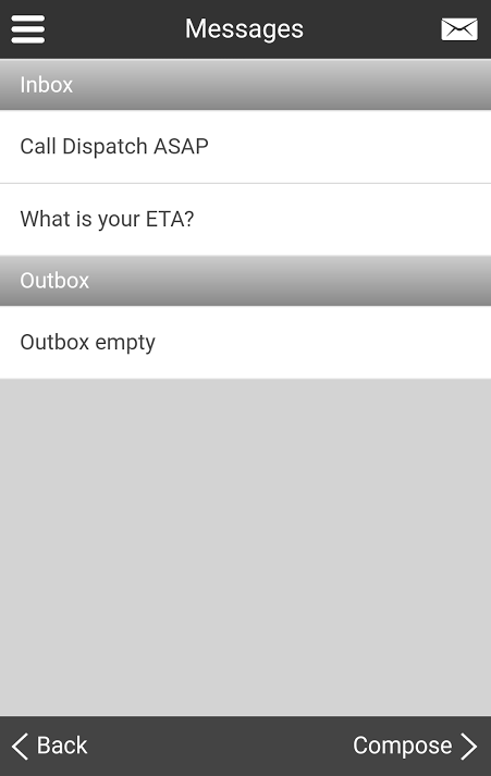
- When a red number is displayed next to the Messages icon, there are unread messages.
- Selecting the Messages icon expands the message list, the number disappears, and all read and/or unread messages are displayed. Unread messages are in bold text.
- To collapse the messages screen, tap anywhere along the left side of the screen.
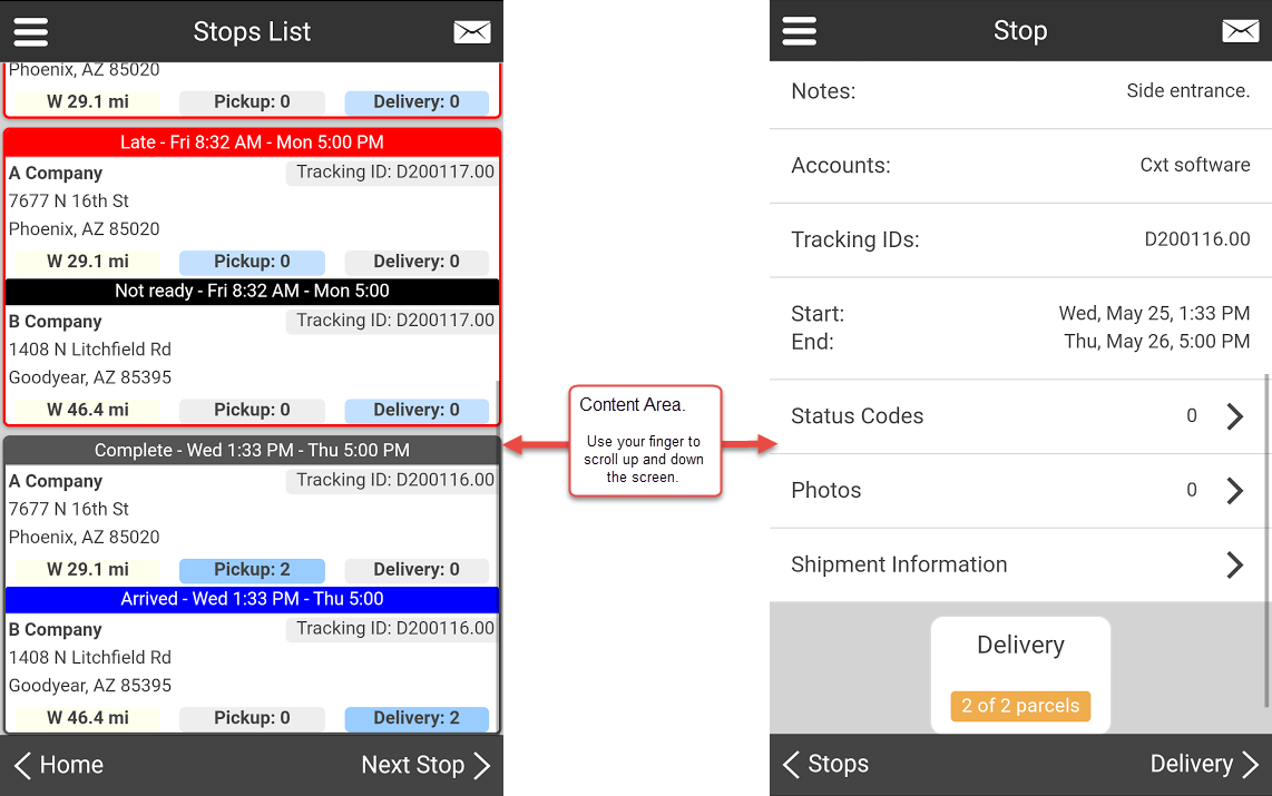
Content Area
The content area is the primary section of the layout that uses the majority of the screen and drives your interaction with the application. When the content fills the screen, use your finger to scroll up and down the page.
Navigation Area
The navigation area is located at the bottom of every Nextstop 2 screen. This area is always located at the bottom of the screen and therefore will not move when the content area is scrolled. The navigation options are either buttons or in tabs to your location within the application.
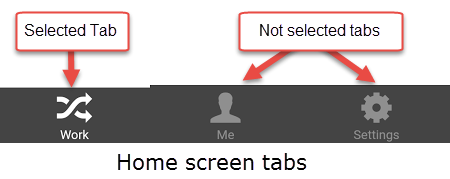
Navigation Tabs
- Navigation tabs are visible on the Nextstop 2 Home Screen.
- Selecting a tab changes the contents of the content area.
- The currently selected tab has a white line above the button, see image below.
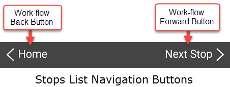
Navigation Buttons
- Nextstop 2 attempts to walk you through your work by using a next-next-next style. You navigate to the suggested next step by selecting the Workflow Forward button located at the bottom-right corner of the screen, or you navigate back using the workflow Back button, located at the bottom-left corner of the screen.
- The Workflow Forward button always suggests the next action in the bottom-right corner of the screen. The title of the button changes based on the step that is suggested.
- Similarly, the Workflow Back button, which is located in the bottom-left corner of the screen, navigates you back to the previous step in your workflow. The title of this button displays the name of the page it returns you to.
- For more details about workflows, see Nextstop 2 Workflows.
Nextstop 2 Getting Started